How to Add a Dark Mode Toggle to Your Carrd Website
Learn how to add a light/dark theme switcher to your Carrd site that remembers user preferences and transitions smoothly.

Dark mode went from niche preference to mainstream expectation. Many visitors browse at night with their phones on dark mode, and a bright white website hits them like a flashlight to the face.
Adding a dark mode toggle to your Carrd site gives visitors control over their experience. They can switch to whatever’s easier on their eyes, and the site remembers their choice for next time.
Carrd.coSome Carrd Tutorials:
- Add Popup Modal to Carrd
- Add Smooth Scroll to Carrd
- Add Testimonial Slider to Carrd
- Add Floating Menu to Carrd
- Add Sidebar Menu to Carrd
- Carrd.co Review
The complete list with Carrd plugins, themes and tutorials you can find on my carrdme.com website.
Why Add Dark Mode
A few reasons to offer theme switching:
-
Reduced eye strain - Dark mode is easier on the eyes in low-light conditions.
-
Battery savings - On OLED screens, dark mode uses less power.
-
User preference - Many people prefer dark interfaces. Giving them the option shows you care about their experience.
-
Modern expectation - Most major apps and websites now offer dark mode. It’s becoming standard.
-
Accessibility - Some users have light sensitivity and genuinely need darker interfaces.
How Dark Mode Works on Carrd
Carrd doesn’t have built-in dark mode, so we’ll add it with custom CSS and JavaScript. The code:
- Creates a toggle button
- Applies dark styles when activated
- Saves the preference to localStorage
- Respects the user’s system preference by default
How to Add Dark Mode to Carrd
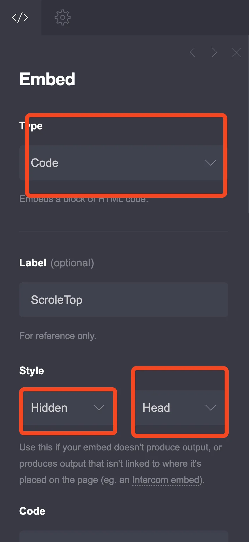
Step 1: Add an Embed Element
Click the + sign and add an Embed element:
- Type: Code
- Style: Inline (important - this displays the toggle button on your page)
Step 2: Choose Your Toggle Style
I’ve created different toggle styles. Pick the one that fits your design.
Option 1: Floating Toggle Button
A small button that floats in the corner of the screen.
<style>
  /* Light mode (default) colors */
  :root {
    --dm-bg-primary: #ffffff;
    --dm-bg-secondary: #f8fafc;
    --dm-text-primary: #1e293b;
    --dm-text-secondary: #64748b;
    --dm-border: #e2e8f0;
    --dm-accent: #3b82f6;
  }

  /* Dark mode colors */
  [data-theme="dark"] {
    --dm-bg-primary: #0f172a;
    --dm-bg-secondary: #1e293b;
    --dm-text-primary: #f1f5f9;
    --dm-text-secondary: #94a3b8;
    --dm-border: #334155;
    --dm-accent: #60a5fa;
  }

  /* Apply colors to Carrd elements */
  [data-theme="dark"] body,
  [data-theme="dark"] #wrapper {
    background-color: var(--dm-bg-primary) !important;
  }

  [data-theme="dark"] #main {
    background-color: var(--dm-bg-primary) !important;
  }

  [data-theme="dark"] h1,
  [data-theme="dark"] h2,
  [data-theme="dark"] h3,
  [data-theme="dark"] h4,
  [data-theme="dark"] p,
  [data-theme="dark"] span,
  [data-theme="dark"] li,
  [data-theme="dark"] a {
    color: var(--dm-text-primary) !important;
  }

  [data-theme="dark"] .inner > * {
    background-color: transparent !important;
  }

  /* Override specific Carrd sections if needed */
  [data-theme="dark"] section,
  [data-theme="dark"] .container {
    background-color: var(--dm-bg-primary) !important;
  }

  /* Style form inputs */
  [data-theme="dark"] input,
  [data-theme="dark"] textarea,
  [data-theme="dark"] select {
    background-color: var(--dm-bg-secondary) !important;
    color: var(--dm-text-primary) !important;
    border-color: var(--dm-border) !important;
  }

  /* Smooth transition */
  body,
  #wrapper,
  #main,
  section,
  h1, h2, h3, h4, p, span, li, a,
  input, textarea {
    transition: background-color 0.3s ease, color 0.3s ease, border-color 0.3s ease;
  }

  /* Toggle button styles */
  .theme-toggle {
    position: fixed;
    bottom: 25px;
    left: 25px;
    width: 50px;
    height: 50px;
    border-radius: 50%;
    border: none;
    cursor: pointer;
    display: flex;
    align-items: center;
    justify-content: center;
    font-size: 24px;
    z-index: 9999;
    background: var(--dm-bg-secondary);
    box-shadow: 0 4px 15px rgba(0, 0, 0, 0.15);
    transition: transform 0.2s, background-color 0.3s;
  }

  .theme-toggle:hover {
    transform: scale(1.1);
  }

  .theme-toggle .icon-sun,
  .theme-toggle .icon-moon {
    position: absolute;
    transition: opacity 0.3s, transform 0.3s;
  }

  .theme-toggle .icon-sun {
    opacity: 1;
    transform: rotate(0deg);
  }

  .theme-toggle .icon-moon {
    opacity: 0;
    transform: rotate(-90deg);
  }

  [data-theme="dark"] .theme-toggle .icon-sun {
    opacity: 0;
    transform: rotate(90deg);
  }

  [data-theme="dark"] .theme-toggle .icon-moon {
    opacity: 1;
    transform: rotate(0deg);
  }
</style>

<button class="theme-toggle" id="themeToggle" aria-label="Toggle dark mode">
  <span class="icon-sun">☀️</span>
  <span class="icon-moon">🌙</span>
</button>

<script>
var themeToggle = document.getElementById('themeToggle');

function getPreferredTheme() {
  var saved = localStorage.getItem('theme');
  if (saved) return saved;
  return window.matchMedia('(prefers-color-scheme: dark)').matches ? 'dark' : 'light';
}

function setTheme(theme) {
  document.documentElement.setAttribute('data-theme', theme);
  localStorage.setItem('theme', theme);
}

setTheme(getPreferredTheme());

themeToggle.onclick = function() {
  var current = document.documentElement.getAttribute('data-theme');
  setTheme(current === 'dark' ? 'light' : 'dark');
};
</script>
Option 2: Header Toggle Switch
A sleek toggle switch that can be placed in your header area.
<style>
  /* Light mode colors */
  :root {
    --dm-bg: #ffffff;
    --dm-bg-alt: #f3f4f6;
    --dm-text: #111827;
    --dm-text-muted: #6b7280;
    --dm-border: #e5e7eb;
  }

  /* Dark mode colors */
  [data-theme="dark"] {
    --dm-bg: #111827;
    --dm-bg-alt: #1f2937;
    --dm-text: #f9fafb;
    --dm-text-muted: #9ca3af;
    --dm-border: #374151;
  }

  /* Apply to page */
  [data-theme="dark"] body,
  [data-theme="dark"] #wrapper,
  [data-theme="dark"] #main {
    background-color: var(--dm-bg) !important;
  }

  [data-theme="dark"] h1,
  [data-theme="dark"] h2,
  [data-theme="dark"] h3,
  [data-theme="dark"] h4,
  [data-theme="dark"] p,
  [data-theme="dark"] span,
  [data-theme="dark"] li,
  [data-theme="dark"] a:not(.button) {
    color: var(--dm-text) !important;
  }

  [data-theme="dark"] section {
    background-color: var(--dm-bg) !important;
  }

  [data-theme="dark"] input,
  [data-theme="dark"] textarea {
    background-color: var(--dm-bg-alt) !important;
    color: var(--dm-text) !important;
    border-color: var(--dm-border) !important;
  }

  /* Transitions */
  *, *::before, *::after {
    transition: background-color 0.3s ease, color 0.3s ease, border-color 0.3s ease;
  }

  /* Toggle switch container */
  .switch-container {
    position: fixed;
    top: 20px;
    right: 20px;
    display: flex;
    align-items: center;
    gap: 10px;
    z-index: 9999;
    background: var(--dm-bg-alt);
    padding: 8px 15px;
    border-radius: 50px;
    box-shadow: 0 2px 10px rgba(0,0,0,0.1);
  }

  .switch-label {
    font-size: 18px;
  }

  .switch {
    position: relative;
    width: 56px;
    height: 28px;
  }

  .switch input {
    opacity: 0;
    width: 0;
    height: 0;
  }

  .switch-slider {
    position: absolute;
    cursor: pointer;
    top: 0;
    left: 0;
    right: 0;
    bottom: 0;
    background-color: #e5e7eb;
    border-radius: 28px;
    transition: 0.3s;
  }

  .switch-slider:before {
    position: absolute;
    content: "";
    height: 22px;
    width: 22px;
    left: 3px;
    bottom: 3px;
    background-color: white;
    border-radius: 50%;
    transition: 0.3s;
    box-shadow: 0 2px 5px rgba(0,0,0,0.2);
  }

  input:checked + .switch-slider {
    background-color: #3b82f6;
  }

  input:checked + .switch-slider:before {
    transform: translateX(28px);
  }
</style>

<div class="switch-container">
  <span class="switch-label">☀️</span>
  <label class="switch">
    <input type="checkbox" id="themeSwitch">
    <span class="switch-slider"></span>
  </label>
  <span class="switch-label">🌙</span>
</div>

<script>
var themeSwitch = document.getElementById('themeSwitch');

function getTheme() {
  var saved = localStorage.getItem('theme');
  if (saved) return saved;
  return window.matchMedia('(prefers-color-scheme: dark)').matches ? 'dark' : 'light';
}

function setTheme(theme) {
  document.documentElement.setAttribute('data-theme', theme);
  localStorage.setItem('theme', theme);
  themeSwitch.checked = (theme === 'dark');
}

setTheme(getTheme());

themeSwitch.onchange = function() {
  setTheme(themeSwitch.checked ? 'dark' : 'light');
};
</script>
Option 3: Minimal Icon Toggle
A simple icon that changes between sun and moon.
<style>
  /* Theme colors */
  :root {
    --page-bg: #ffffff;
    --page-bg-alt: #f9fafb;
    --page-text: #18181b;
    --page-text-muted: #71717a;
  }

  [data-theme="dark"] {
    --page-bg: #18181b;
    --page-bg-alt: #27272a;
    --page-text: #fafafa;
    --page-text-muted: #a1a1aa;
  }

  [data-theme="dark"] body,
  [data-theme="dark"] #wrapper,
  [data-theme="dark"] #main,
  [data-theme="dark"] section {
    background-color: var(--page-bg) !important;
  }

  [data-theme="dark"] h1,
  [data-theme="dark"] h2,
  [data-theme="dark"] h3,
  [data-theme="dark"] h4,
  [data-theme="dark"] p,
  [data-theme="dark"] span,
  [data-theme="dark"] li,
  [data-theme="dark"] a:not(.button) {
    color: var(--page-text) !important;
  }

  [data-theme="dark"] input,
  [data-theme="dark"] textarea {
    background-color: var(--page-bg-alt) !important;
    color: var(--page-text) !important;
  }

  * {
    transition: background-color 0.25s, color 0.25s;
  }

  /* Minimal toggle */
  .minimal-toggle {
    position: fixed;
    top: 20px;
    right: 20px;
    width: 44px;
    height: 44px;
    border: 2px solid var(--page-text);
    border-radius: 50%;
    background: transparent;
    cursor: pointer;
    display: flex;
    align-items: center;
    justify-content: center;
    font-size: 20px;
    z-index: 9999;
    transition: all 0.3s;
  }

  .minimal-toggle:hover {
    background: var(--page-bg-alt);
    transform: rotate(20deg);
  }

  [data-theme="dark"] .minimal-toggle {
    border-color: var(--page-text);
  }

  .minimal-toggle .sun-icon {
    display: block;
  }

  .minimal-toggle .moon-icon {
    display: none;
  }

  [data-theme="dark"] .minimal-toggle .sun-icon {
    display: none;
  }

  [data-theme="dark"] .minimal-toggle .moon-icon {
    display: block;
  }
</style>

<button class="minimal-toggle" id="minimalToggle" aria-label="Toggle theme">
  <span class="sun-icon">☀️</span>
  <span class="moon-icon">🌙</span>
</button>

<script>
var minimalToggle = document.getElementById('minimalToggle');

function getTheme() {
  var saved = localStorage.getItem('theme');
  if (saved) return saved;
  return window.matchMedia('(prefers-color-scheme: dark)').matches ? 'dark' : 'light';
}

function applyTheme(theme) {
  document.documentElement.setAttribute('data-theme', theme);
  localStorage.setItem('theme', theme);
}

applyTheme(getTheme());

minimalToggle.onclick = function() {
  var current = document.documentElement.getAttribute('data-theme');
  applyTheme(current === 'dark' ? 'light' : 'dark');
};
</script>
Customizing Dark Mode Colors
The CSS variables at the top control your colors. Here’s what to change:
Light Mode Colors (in :root)
:root {
  --dm-bg-primary: #ffffff;     /* Main background */
  --dm-bg-secondary: #f8fafc;   /* Secondary background (cards, inputs) */
  --dm-text-primary: #1e293b;   /* Main text color */
  --dm-text-secondary: #64748b; /* Muted text */
  --dm-border: #e2e8f0;         /* Border color */
  --dm-accent: #3b82f6;         /* Accent/link color */
}
Dark Mode Colors (in [data-theme="dark"])
[data-theme="dark"] {
  --dm-bg-primary: #0f172a;     /* Dark background */
  --dm-bg-secondary: #1e293b;   /* Slightly lighter dark */
  --dm-text-primary: #f1f5f9;   /* Light text */
  --dm-text-secondary: #94a3b8; /* Muted light text */
  --dm-border: #334155;         /* Dark border */
  --dm-accent: #60a5fa;         /* Lighter accent for contrast */
}
Handling Carrd-Specific Elements
Carrd generates specific class names that might need additional targeting. If some elements don’t change color, add more specific selectors:
/* Target specific Carrd elements */
[data-theme="dark"] .inner,
[data-theme="dark"] .content,
[data-theme="dark"] [class*="style1"],
[data-theme="dark"] [class*="style2"] {
  background-color: var(--dm-bg-primary) !important;
  color: var(--dm-text-primary) !important;
}

/* Target buttons */
[data-theme="dark"] .button.primary {
  background-color: var(--dm-accent) !important;
}

/* Target icons */
[data-theme="dark"] .icon {
  filter: brightness(0) invert(1);
}
Handling Images
Images might look jarring against a dark background. You can soften them:
[data-theme="dark"] img {
  opacity: 0.9;
  filter: brightness(0.95);
}

/* Or add a subtle border */
[data-theme="dark"] img {
  border: 1px solid var(--dm-border);
  border-radius: 8px;
}
Positioning the Toggle
Change the position by modifying these CSS properties:
Bottom left (default in Option 1):
bottom: 25px;
left: 25px;
Top right:
top: 25px;
right: 25px;
Bottom right:
bottom: 25px;
right: 25px;
Tips for Better Dark Mode
Test contrast - Make sure text is readable against dark backgrounds. Use a contrast checker if unsure.
Don’t go pure black - #000000 is too harsh. Use dark grays like #0f172a or #1e293b instead.
Lighten your accent color - Bright colors that work on white backgrounds often need to be lightened for dark backgrounds.
Check all elements - Test every section of your Carrd site. Some elements might need additional CSS targeting.
Consider images - Logos and images designed for light backgrounds might need adjustments or alternative versions.
Try Carrd.coConclusion
Dark mode is no longer a nice-to-have feature. Visitors expect the option, especially on sites they might view at night. The toggle takes maybe 10 minutes to implement and significantly improves user experience for a large portion of your audience.
Start with Option 1 (the floating button) if you’re unsure which style to choose. It works with any layout and stays out of the way.