How to Add a Popup Modal to Your Carrd Website
Learn how to add customizable popup modals to your Carrd site for email capture, announcements, or image lightboxes with complete code examples.

Popups get a bad reputation, mostly because people abuse them. But a well-timed modal can capture emails, announce sales, or display important information without cluttering your main page.
Carrd.co doesn’t have built-in popup functionality, but you can add it with custom code. I’ll show you three different popup types you can use depending on your needs.
Carrd.coSome Carrd Tutorials:
- Add Smooth Scroll to Carrd
- Add Testimonial Slider to Carrd
- Add Dark Mode Toggle to Carrd
- Add Floating Menu to Carrd
- Add Sidebar Menu to Carrd
- Carrd.co Review
The complete list with Carrd plugins, themes and tutorials you can find on my carrdme.com website.
Why Add Popups to Your Carrd Site
Popups work well for specific situations:
-
Email capture - Grow your newsletter list without dedicating prime page space to signup forms.
-
Announcements - Let visitors know about sales, new products, or important updates.
-
Image lightboxes - Display larger versions of portfolio images or product photos.
-
Exit intent - Catch visitors before they leave with a final offer.
-
Welcome messages - Greet first-time visitors or share critical information.
The key is using them thoughtfully. Don’t pop up immediately when someone lands on your page. Give them a few seconds to look around first.
How to Add a Popup Modal to Carrd
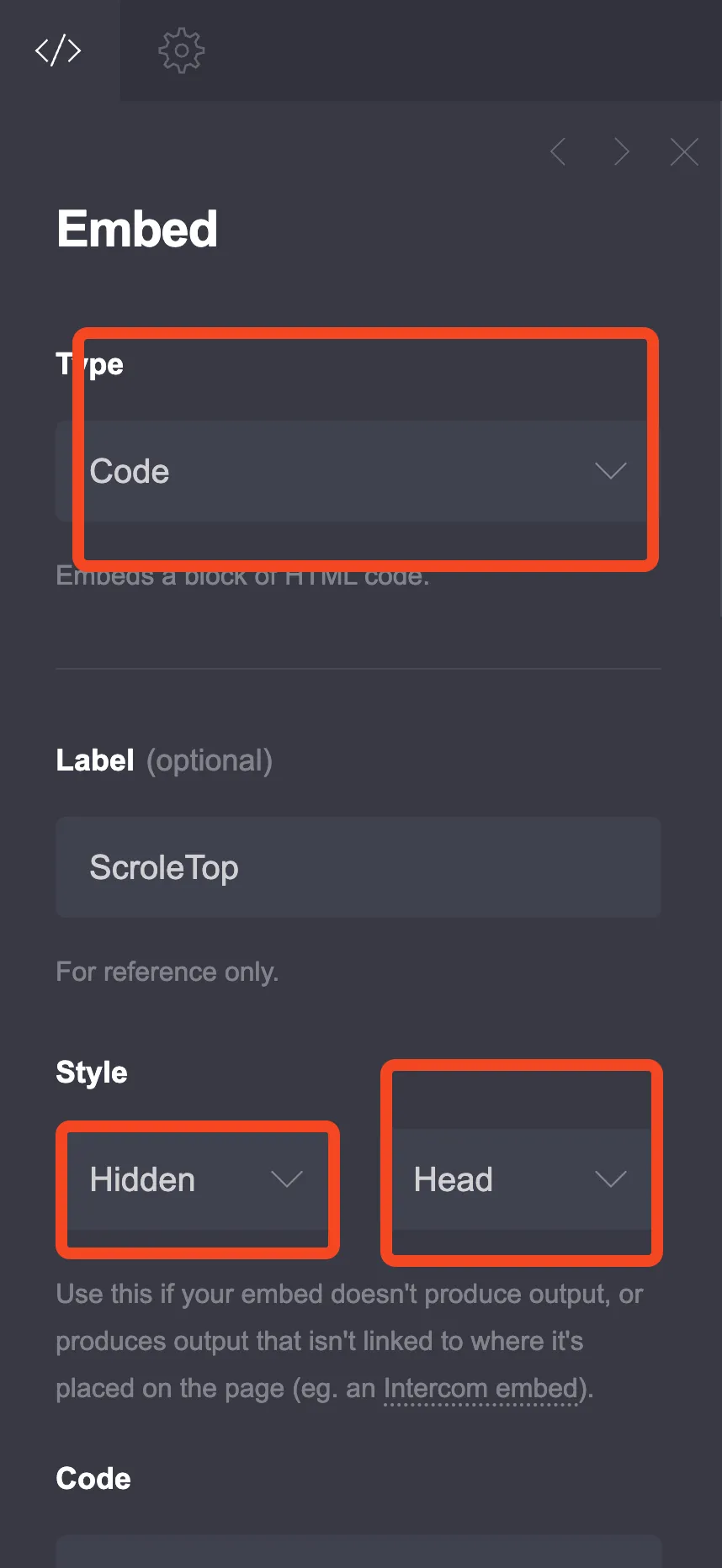
Step 1: Add an Embed Element
Go to the + sign in Carrd and add an Embed element anywhere on your page. Configure it like this:
- Type: Code
- Style: Hidden, Head
Step 2: Choose Your Popup Type
I’ve created three different popup styles. Pick the one that fits your needs.
Option 1: Timed Email Capture Popup
This popup appears after a delay and includes an email signup form. Good for newsletter signups.
<style>
  :root {
    --popup-bg: #ffffff;
    --popup-overlay: rgba(0, 0, 0, 0.6);
    --popup-accent: #4f46e5;
    --popup-text: #1f2937;
    --popup-secondary: #6b7280;
    --popup-radius: 16px;
    --popup-width: 450px;
    --popup-delay: 3000; /* milliseconds before popup shows */
  }

  .modal-overlay {
    position: fixed;
    top: 0;
    left: 0;
    width: 100%;
    height: 100%;
    background: var(--popup-overlay);
    display: none;
    justify-content: center;
    align-items: center;
    z-index: 9999;
    opacity: 0;
    transition: opacity 0.3s ease;
  }

  .modal-overlay.active {
    display: flex;
    opacity: 1;
  }

  .modal-content {
    background: var(--popup-bg);
    border-radius: var(--popup-radius);
    max-width: var(--popup-width);
    width: 90%;
    padding: 40px;
    position: relative;
    transform: scale(0.8);
    transition: transform 0.3s ease;
    box-shadow: 0 25px 50px -12px rgba(0, 0, 0, 0.25);
  }

  .modal-overlay.active .modal-content {
    transform: scale(1);
  }

  .modal-close {
    position: absolute;
    top: 15px;
    right: 15px;
    width: 32px;
    height: 32px;
    border: none;
    background: #f3f4f6;
    border-radius: 50%;
    cursor: pointer;
    font-size: 20px;
    color: var(--popup-secondary);
    display: flex;
    align-items: center;
    justify-content: center;
    transition: background 0.2s;
  }

  .modal-close:hover {
    background: #e5e7eb;
  }

  .modal-title {
    font-size: 24px;
    font-weight: 700;
    color: var(--popup-text);
    margin: 0 0 10px 0;
    text-align: center;
  }

  .modal-description {
    font-size: 16px;
    color: var(--popup-secondary);
    margin: 0 0 25px 0;
    text-align: center;
    line-height: 1.5;
  }

  .modal-form {
    display: flex;
    flex-direction: column;
    gap: 15px;
  }

  .modal-input {
    padding: 14px 18px;
    border: 2px solid #e5e7eb;
    border-radius: 10px;
    font-size: 16px;
    transition: border-color 0.2s;
    outline: none;
  }

  .modal-input:focus {
    border-color: var(--popup-accent);
  }

  .modal-button {
    padding: 14px 24px;
    background: var(--popup-accent);
    color: white;
    border: none;
    border-radius: 10px;
    font-size: 16px;
    font-weight: 600;
    cursor: pointer;
    transition: background 0.2s, transform 0.1s;
  }

  .modal-button:hover {
    background: #4338ca;
    transform: translateY(-1px);
  }

  .modal-note {
    font-size: 13px;
    color: var(--popup-secondary);
    text-align: center;
    margin-top: 15px;
  }

  @media (max-width: 480px) {
    .modal-content {
      padding: 30px 20px;
    }
    .modal-title {
      font-size: 20px;
    }
  }
</style>

<div class="modal-overlay" id="emailModal">
  <div class="modal-content">
    <button class="modal-close" onclick="closeModal()">×</button>
    <h2 class="modal-title">Get Weekly Tips</h2>
    <p class="modal-description">Join 5,000+ subscribers getting practical advice delivered to their inbox every week.</p>
    <form class="modal-form" action="YOUR_FORM_ENDPOINT" method="POST">
      <input type="email" name="email" class="modal-input" placeholder="Enter your email" required>
      <button type="submit" class="modal-button">Subscribe</button>
    </form>
    <p class="modal-note">No spam. Unsubscribe anytime.</p>
  </div>
</div>

<script>
  function showModal() {
    document.getElementById('emailModal').classList.add('active');
    document.body.style.overflow = 'hidden';
  }

  function closeModal() {
    document.getElementById('emailModal').classList.remove('active');
    document.body.style.overflow = '';
    sessionStorage.setItem('modalShown', 'true');
  }

  // Close on overlay click
  document.getElementById('emailModal').addEventListener('click', function(e) {
    if (e.target === this) closeModal();
  });

  // Close on Escape key
  document.addEventListener('keydown', function(e) {
    if (e.key === 'Escape') closeModal();
  });

  // Show popup after delay (only once per session)
  if (!sessionStorage.getItem('modalShown')) {
    setTimeout(showModal, 3000);
  }
</script>
Customization Options
Change the delay: Find setTimeout(showModal, 3000) and change 3000 to your preferred delay in milliseconds (3000 = 3 seconds).
Change colors: Modify the CSS variables at the top:
--popup-accentcontrols the button color--popup-bgcontrols the background--popup-textcontrols the text color
Connect to your email service: Replace YOUR_FORM_ENDPOINT with your actual form endpoint from Mailchimp, ConvertKit, or whatever service you use. Most email platforms give you a form action URL.
Option 2: Click-Triggered Popup
This popup only appears when visitors click a button. Better for product details, terms, or additional information.
<style>
  :root {
    --click-popup-bg: #ffffff;
    --click-popup-overlay: rgba(0, 0, 0, 0.7);
    --click-popup-accent: #10b981;
    --click-popup-text: #111827;
    --click-popup-radius: 20px;
  }

  .click-modal-overlay {
    position: fixed;
    top: 0;
    left: 0;
    width: 100%;
    height: 100%;
    background: var(--click-popup-overlay);
    display: none;
    justify-content: center;
    align-items: center;
    z-index: 9999;
    padding: 20px;
  }

  .click-modal-overlay.active {
    display: flex;
  }

  .click-modal-content {
    background: var(--click-popup-bg);
    border-radius: var(--click-popup-radius);
    max-width: 600px;
    width: 100%;
    max-height: 80vh;
    overflow-y: auto;
    position: relative;
    animation: slideUp 0.3s ease;
  }

  @keyframes slideUp {
    from {
      opacity: 0;
      transform: translateY(30px);
    }
    to {
      opacity: 1;
      transform: translateY(0);
    }
  }

  .click-modal-header {
    padding: 25px 30px;
    border-bottom: 1px solid #e5e7eb;
    display: flex;
    justify-content: space-between;
    align-items: center;
  }

  .click-modal-title {
    font-size: 22px;
    font-weight: 700;
    color: var(--click-popup-text);
    margin: 0;
  }

  .click-modal-close {
    width: 36px;
    height: 36px;
    border: none;
    background: #f3f4f6;
    border-radius: 50%;
    cursor: pointer;
    font-size: 22px;
    color: #6b7280;
    display: flex;
    align-items: center;
    justify-content: center;
  }

  .click-modal-close:hover {
    background: #e5e7eb;
  }

  .click-modal-body {
    padding: 30px;
    color: #4b5563;
    line-height: 1.7;
  }

  .click-modal-body h3 {
    color: var(--click-popup-text);
    margin: 0 0 15px 0;
    font-size: 18px;
  }

  .click-modal-body p {
    margin: 0 0 20px 0;
  }

  .click-modal-body ul {
    margin: 0 0 20px 0;
    padding-left: 20px;
  }

  .click-modal-body li {
    margin-bottom: 10px;
  }

  .click-modal-footer {
    padding: 20px 30px;
    border-top: 1px solid #e5e7eb;
    text-align: right;
  }

  .click-modal-btn {
    padding: 12px 28px;
    background: var(--click-popup-accent);
    color: white;
    border: none;
    border-radius: 10px;
    font-size: 16px;
    font-weight: 600;
    cursor: pointer;
  }

  .click-modal-btn:hover {
    opacity: 0.9;
  }

  /* Trigger button style */
  .popup-trigger {
    padding: 14px 28px;
    background: var(--click-popup-accent);
    color: white;
    border: none;
    border-radius: 10px;
    font-size: 16px;
    font-weight: 600;
    cursor: pointer;
    transition: transform 0.2s;
  }

  .popup-trigger:hover {
    transform: translateY(-2px);
  }
</style>

<div class="click-modal-overlay" id="clickModal">
  <div class="click-modal-content">
    <div class="click-modal-header">
      <h2 class="click-modal-title">Service Details</h2>
      <button class="click-modal-close" onclick="closeClickModal()">×</button>
    </div>
    <div class="click-modal-body">
      <h3>What's Included</h3>
      <ul>
        <li>Full website design and development</li>
        <li>Mobile-responsive layout</li>
        <li>SEO optimization</li>
        <li>2 rounds of revisions</li>
        <li>30 days of support after launch</li>
      </ul>
      <p>Turnaround time is typically 2-3 weeks depending on project complexity. We'll discuss your specific needs during our initial consultation.</p>
    </div>
    <div class="click-modal-footer">
      <button class="click-modal-btn" onclick="closeClickModal()">Got It</button>
    </div>
  </div>
</div>

<script>
  function openClickModal() {
    document.getElementById('clickModal').classList.add('active');
    document.body.style.overflow = 'hidden';
  }

  function closeClickModal() {
    document.getElementById('clickModal').classList.remove('active');
    document.body.style.overflow = '';
  }

  document.getElementById('clickModal').addEventListener('click', function(e) {
    if (e.target === this) closeClickModal();
  });

  document.addEventListener('keydown', function(e) {
    if (e.key === 'Escape') closeClickModal();
  });
</script>
Adding the Trigger Button
To trigger this popup, add a button element in Carrd with this onclick attribute, or add another embed with:
<button class="popup-trigger" onclick="openClickModal()">Learn More</button>Alternatively, you can use Carrd’s built-in button and add this to its URL field:
javascript:openClickModal()Option 3: Exit Intent Popup
This popup appears when visitors move their mouse toward the browser’s close button. Last chance to capture their attention.
<style>
  :root {
    --exit-popup-bg: linear-gradient(135deg, #667eea 0%, #764ba2 100%);
    --exit-popup-card: #ffffff;
    --exit-popup-text: #1f2937;
  }

  .exit-modal-overlay {
    position: fixed;
    top: 0;
    left: 0;
    width: 100%;
    height: 100%;
    background: rgba(0, 0, 0, 0.8);
    display: none;
    justify-content: center;
    align-items: center;
    z-index: 9999;
    padding: 20px;
  }

  .exit-modal-overlay.active {
    display: flex;
  }

  .exit-modal-content {
    background: var(--exit-popup-bg);
    border-radius: 24px;
    max-width: 500px;
    width: 100%;
    padding: 50px 40px;
    position: relative;
    text-align: center;
    animation: bounceIn 0.4s ease;
  }

  @keyframes bounceIn {
    0% {
      opacity: 0;
      transform: scale(0.5);
    }
    70% {
      transform: scale(1.05);
    }
    100% {
      opacity: 1;
      transform: scale(1);
    }
  }

  .exit-modal-close {
    position: absolute;
    top: 15px;
    right: 15px;
    width: 36px;
    height: 36px;
    border: none;
    background: rgba(255,255,255,0.2);
    border-radius: 50%;
    cursor: pointer;
    font-size: 20px;
    color: white;
  }

  .exit-modal-close:hover {
    background: rgba(255,255,255,0.3);
  }

  .exit-modal-emoji {
    font-size: 60px;
    margin-bottom: 20px;
  }

  .exit-modal-title {
    font-size: 28px;
    font-weight: 700;
    color: white;
    margin: 0 0 15px 0;
  }

  .exit-modal-description {
    font-size: 18px;
    color: rgba(255,255,255,0.9);
    margin: 0 0 30px 0;
    line-height: 1.6;
  }

  .exit-modal-cta {
    padding: 16px 40px;
    background: white;
    color: #667eea;
    border: none;
    border-radius: 12px;
    font-size: 18px;
    font-weight: 700;
    cursor: pointer;
    transition: transform 0.2s;
    margin-bottom: 15px;
  }

  .exit-modal-cta:hover {
    transform: scale(1.05);
  }

  .exit-modal-skip {
    background: none;
    border: none;
    color: rgba(255,255,255,0.7);
    font-size: 14px;
    cursor: pointer;
    text-decoration: underline;
  }

  .exit-modal-skip:hover {
    color: white;
  }

  @media (max-width: 480px) {
    .exit-modal-content {
      padding: 40px 25px;
    }
    .exit-modal-title {
      font-size: 24px;
    }
  }
</style>

<div class="exit-modal-overlay" id="exitModal">
  <div class="exit-modal-content">
    <button class="exit-modal-close" onclick="closeExitModal()">×</button>
    <div class="exit-modal-emoji">👋</div>
    <h2 class="exit-modal-title">Wait! Before You Go...</h2>
    <p class="exit-modal-description">Get 20% off your first order when you sign up for our newsletter.</p>
    <button class="exit-modal-cta" onclick="window.location.href='#signup'">Claim My Discount</button>
    <br>
    <button class="exit-modal-skip" onclick="closeExitModal()">No thanks, I'll pay full price</button>
  </div>
</div>

<script>
  let exitShown = false;

  function closeExitModal() {
    document.getElementById('exitModal').classList.remove('active');
    document.body.style.overflow = '';
    sessionStorage.setItem('exitModalShown', 'true');
  }

  document.getElementById('exitModal').addEventListener('click', function(e) {
    if (e.target === this) closeExitModal();
  });

  // Exit intent detection (desktop only)
  document.addEventListener('mouseout', function(e) {
    if (!e.toElement && !e.relatedTarget && e.clientY < 10) {
      if (!exitShown && !sessionStorage.getItem('exitModalShown')) {
        document.getElementById('exitModal').classList.add('active');
        document.body.style.overflow = 'hidden';
        exitShown = true;
      }
    }
  });
</script>
This popup only works on desktop since mobile devices don’t have the same mouse behavior. On mobile, you might want to trigger it based on scroll position or time on page instead.
Tips for Effective Popups
Don’t be annoying. Show the popup once per session, not every page load. All the code examples above use sessionStorage to prevent repeat popups.
Make closing easy. The close button should be obvious. Let people click outside to dismiss. Support the Escape key.
Provide value. Nobody wants to sign up for “updates.” Offer something specific: a discount, a free guide, exclusive content.
Test on mobile. Some popup styles don’t work well on small screens. Check your design on actual phones.
Consider timing. Immediate popups feel aggressive. Waiting 3-5 seconds or triggering on scroll often works better.
Connecting to Email Services
Replace YOUR_FORM_ENDPOINT in the email capture popup with your actual form URL:
Mailchimp: Use your list’s signup form action URL from Audience > Signup forms
ConvertKit: Get the form action URL from Forms > your form > HTML
Buttondown: Use https://buttondown.email/api/emails/embed-subscribe/YOUR_USERNAME
Most services provide an HTML form that you can extract the action URL from.
Try Carrd.coConclusion
Popups aren’t evil - they’re just often used poorly. A well-designed modal that appears at the right time and offers real value can grow your email list without annoying visitors.
Pick the popup style that fits your needs, customize the colors and copy, and remember: less is more. One thoughtful popup beats three aggressive ones.